


Think about how you skim through room descriptions before booking your hotel stay.
Or how your eyes drift over to the reviews section before you order those Sony headphones from Amazon.
No one likes wasting their money on the wrong service or product. Plain and simple.
Your customers are no different.
And so they do their research.
From the moment they land on your website to the second they buy, prospects are interacting with your website in dozens of ways.
One click, one scroll, one webpage at a time they’re making their mind up about you and your offering.
These interactions form a part of what we sometimes call user experience.
Let’s start from scratch: what is user experience?
What does user experience have to do with SEO?
Website user experience is the overall feel and satisfaction you get while interacting with a website.
It’s about how simple it is for users to navigate, find info, and complete tasks on your site.
A better user experience means happier website visitors.
Happier website visitors stay around longer.

And that’s why marketers, designers and developers huddle in meeting rooms and puzzle over questions like these ones:
How can we improve our website page speed? Is it easy for our users to find what they’re looking for? How can we make our content more relevant to our users?
While the design of your website might make people go “ooh” or “ahh”, it’s the practical stuff — usability, page speed, and findability — that gets them to stay, browse, and buy
That’s where SEO comes in.
At its core, SEO is about creating an experience that Google wants to send its users to.
The way you design your site affects how well it ranks, how long visitors stick around, and ultimately, how much business it pulls in.
SEO-friendly tips for your website
Here’s a harsh truth: nobody cares how “cool” your website looks if it takes forever to load.
Fancy animations and high-resolution images might make your designer beam with pride, but they could be the silent killer of your rankings.
Whether you’re doing local SEO or any other type of SEO, Google has made it clear that speed matters.
SEO tip: Work on your page speed
This is how you can quickly check your page speed:
- Visit Google PageSpeed Insights.
- Enter your URL: Type in the URL of the page you want to test — whether it’s your homepage, a product page, or a blog post.
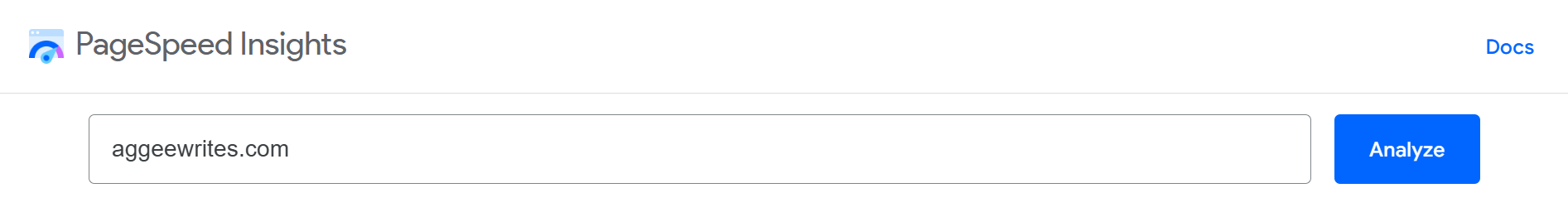
- Hit the Analyse button: Google will crunch the numbers and give you a score from 0 to 100 for both mobile and desktop performance.
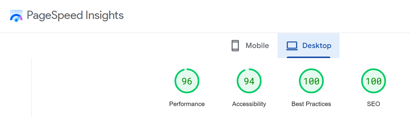
What your score means💡
- 90–100: You’re crushing it!
- 50–89: Middle of the road — you’ve got some work to do.
- 0–49: Ouch. Time to roll up your sleeves.
I’ve made a list of common page speed issues and how to fix them.
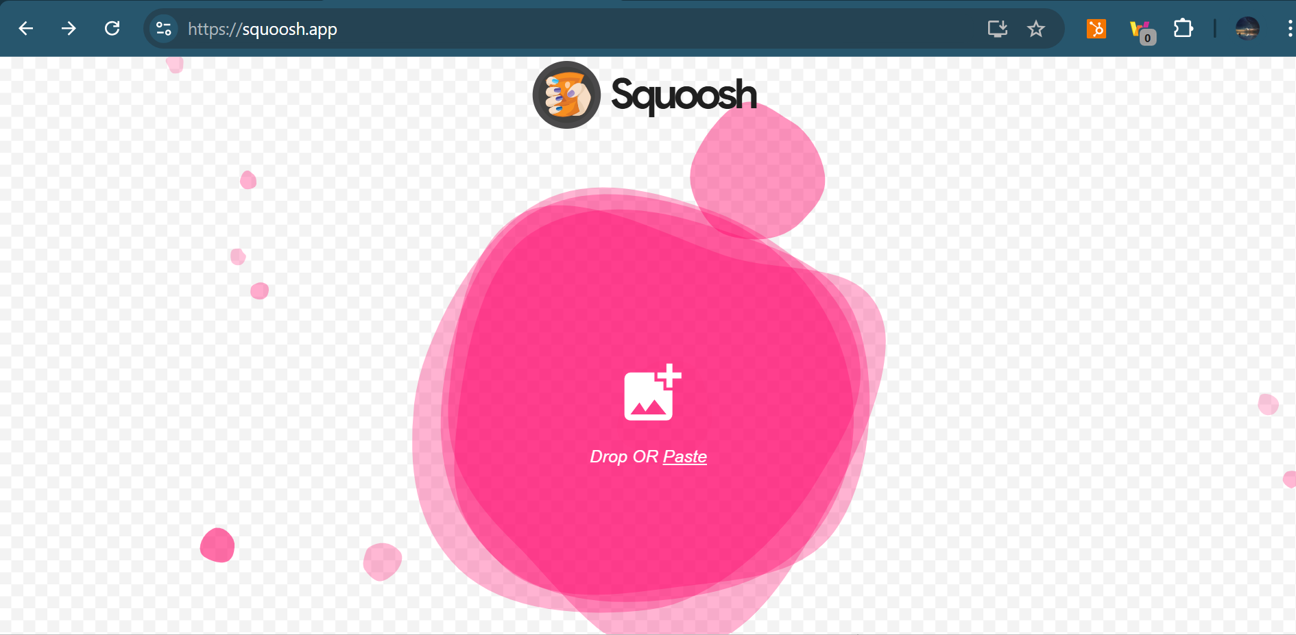
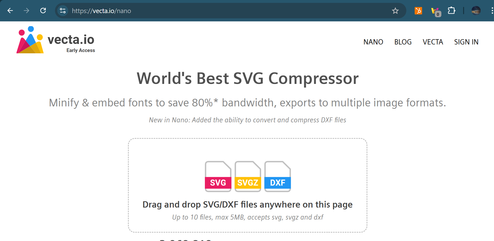
1. Compress large images
2. Use CDNs
The internet is fast, but data still has to physically travel.
If your server is in New York and someone in Australia is visiting your site, their request has to cross oceans.
That’s why your site feels slow for people far from your hosting location.
The solution? A Content Delivery Network (CDN) like Cloudflare stores copies of your website on servers across the globe.
When a visitor clicks your link, they’re served from the closest server, cutting down the travel time and bumping up load speed.
If the idea of setting up a CDN makes your palms sweat, don’t worry.
Here’s a beginner-friendly YouTube video on setting up Cloudflare that walks you through the process step-by-step:
3. Use a caching plugin
Even after compressing images and setting up a CDN, your site can still feel sluggish.
Why?
Because every time a visitor loads your page, your server has to build it from scratch—fetching data, loading images, and piecing together all the elements.
A caching plugin saves a “snapshot” of your site’s pages so they’re ready to serve instantly, cutting out the rebuild process for repeat visitors.
My Setup: WP Fastest Cache + Elementor
I personally built my site on Elementor (a drag-and-drop WordPress builder) and use the WP Fastest Cache plugin.
It’s simple to set up, and honestly, it works like a charm.
UX-friendly design tips for your website
Now let’s look at some ideas for brushing up your website’s design.
All of these ideas are low-maintenance:
Limit choice overload when possible
It’s tough to make a decision when you’re bombarded with too many options.
Psychologists invented a name for this phenomenon. They call it choice overload.
Perhaps bestselling author of Paradox of Choice Barry Schwartz puts it best:
“Learning to choose is hard. Learning to choose well is harder. And learning to choose well in a world of unlimited possibilities is harder still, perhaps too hard.”
Too many choices leads to analysis paralysis.
Your users get confused, and overwhelmed by all your options. They can’t make a decision and so they find the nearest exit.

Don’t make choosing hard for your users.
Limit choice overload with these straightforward design tips:
Divide products by purpose
Category-based navigation works like a charm for many websites, but not all.
People don’t always see products in discrete categories.
Sometimes we see products in terms of the end goals we want to achieve with them.
Let me explain with a scenario:
Let’s say someone wants to buy a brand-new camera online from your website.
They’re a beginner and don’t know the difference between mirrorless and DSLR cameras.
All they know is they want a cheap, compact camera that they can use for filming YouTube vlogs.
Nothing more, nothing less.
It’d be easier for them to find exactly what they wanted if you organised the cameras on your website based on the specific needs they solved, rather than the features they have.
Imagine if our users could narrow down their options based on how suitable each camera is for their needs – whether that’s filmmaking, landscape photography, or vlogging.

This is the strategy surveillance equipment retailer Spy Guy use on their website.
Spy Guy are well aware that people tend to buy surveillance equipment to deal with the concerns they have – concerns like preventing theft, recording instances of workplace harassment or watching the babysitter.
So they went ahead and added a convenient “Shop by Concern” feature:
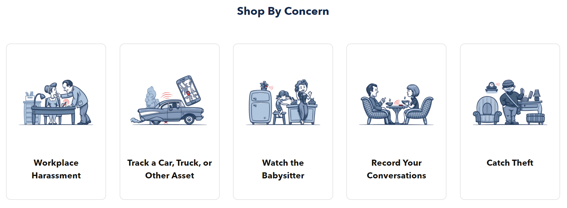
You can narrow down product choices based on the specific concerns you have.
But they don’t stop there.
They’ve also included a “Shop by Category” section for those users who do know what they want.
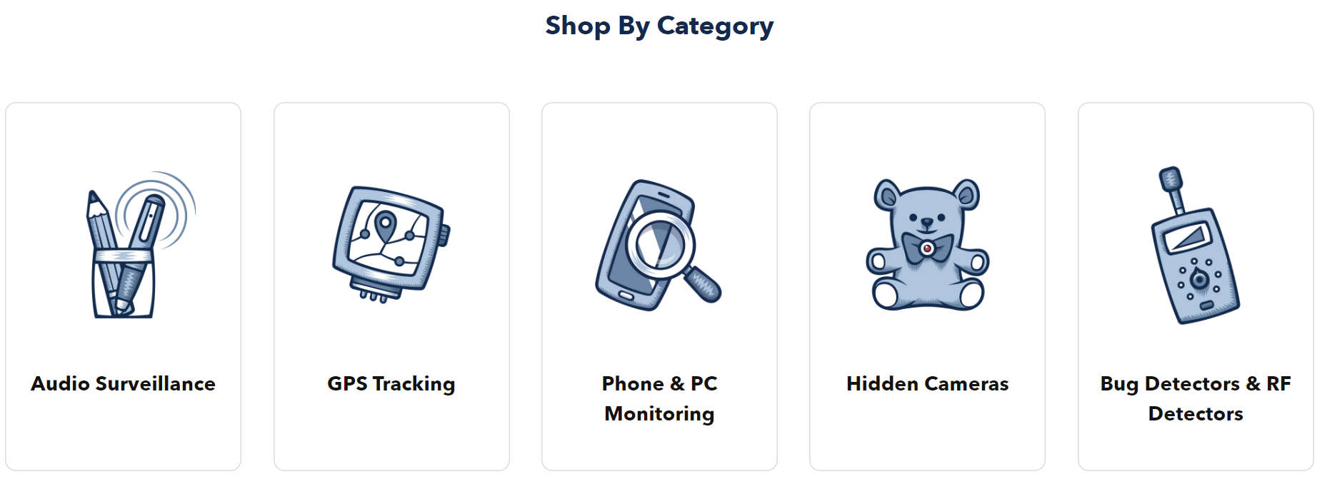
Sweet! Saves the user time and makes it easier for them to find what they’re looking for.
Two birds, one stone.
Tag products with personalised recommendations
Nothing beats in-house knowledge from the founder and his team.
You know your products better than anyone else.
If anyone can lead your customers to greener pastures, it’s you.
So help your users make the best purchase decision by adding product recommendations.
Let’s go back to the camera scenario.
We’d need to consider many factors before recommending the perfect camera for users:
Are they a beginner or a veteran photographer? What’s their budget range? Do they want to use the camera for a specific purpose?
This is where personalised recommendations are handy.
Label your products according to your recommendations.
Like the ones below:
- Perfect for beginners
- Perfect for landscape photography
- Perfect for filmmaking
Make buying easy for your customers.
Show your value with a product comparison landing page
Compare your products to your competitor’s ones, side-by-side.
These pages work even better if you’re selling expensive, feature-heavy products.
Comparison pages slot in perfectly at the consideration stage of the sales cycle.
Plus they help shoppers identify the best-fit product from a quick glance.
The main ingredients to a product comparison page include:
- Show off products: hook reader attention with stunning graphics and images.
- Consider shopper interests: highlight the most important features at the top of the chart.
- Include social proof: add customer reviews and ratings to your charts – e.g. compare overall customer satisfaction rate.
If you’re on a tight budget and don’t have much experience in design, use free online graphic design tools.
Here are some free-to-use tools that provide customisable comparison charts:
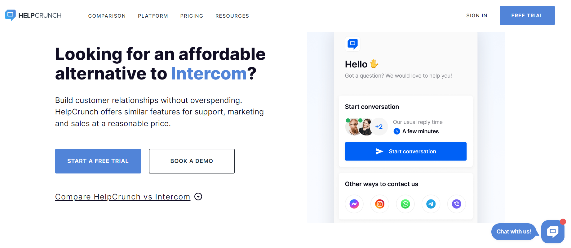
If you want a more professional look, hire a pro designer to create a custom design.
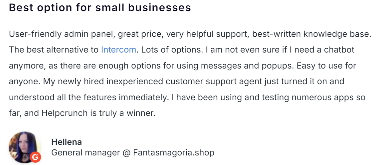
Look at the custom-designed comparison page HelpCrunch designed to show how their customer service software stacks up against their competitor Intercom:
They pepper testimonials from real customers who jumped ship and switched from Intercom to HelpCrunch:
Use an interactive quiz to guide buyers
Quizzes add a unique but delightful twist to the user experience.
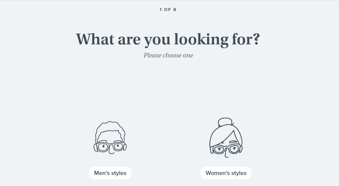
You’ll find the option to start a short quiz on eyewear retailer Warby Parker’s homepage.
They use this quiz to prepare customers for their “home try-on” experience.
Eight questions. Each one helps you narrow down frame options based on your style preferences and face shape:
Next, the quiz asks the user about their face width:
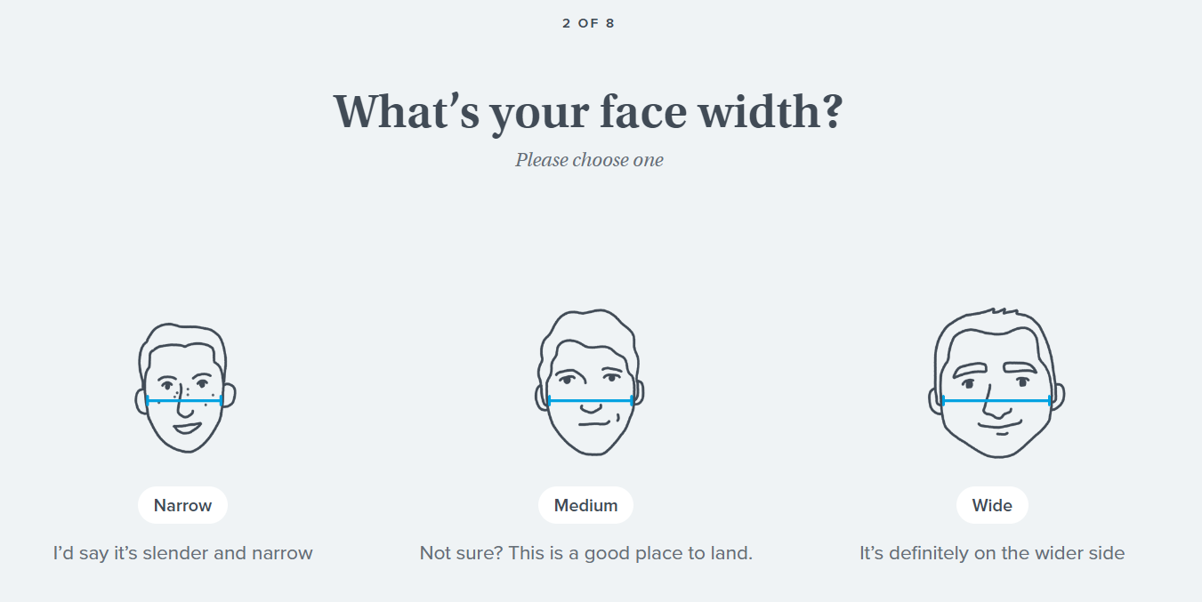
Afterwards, the quiz asks the user which colours they like and what materials they prefer and a few more straightforward questions.
Five questions later, the user arrives at a product page that displays frame recommendations based on the their answers.
Warby Parker even grants the user the power to select a colour or favourite style:
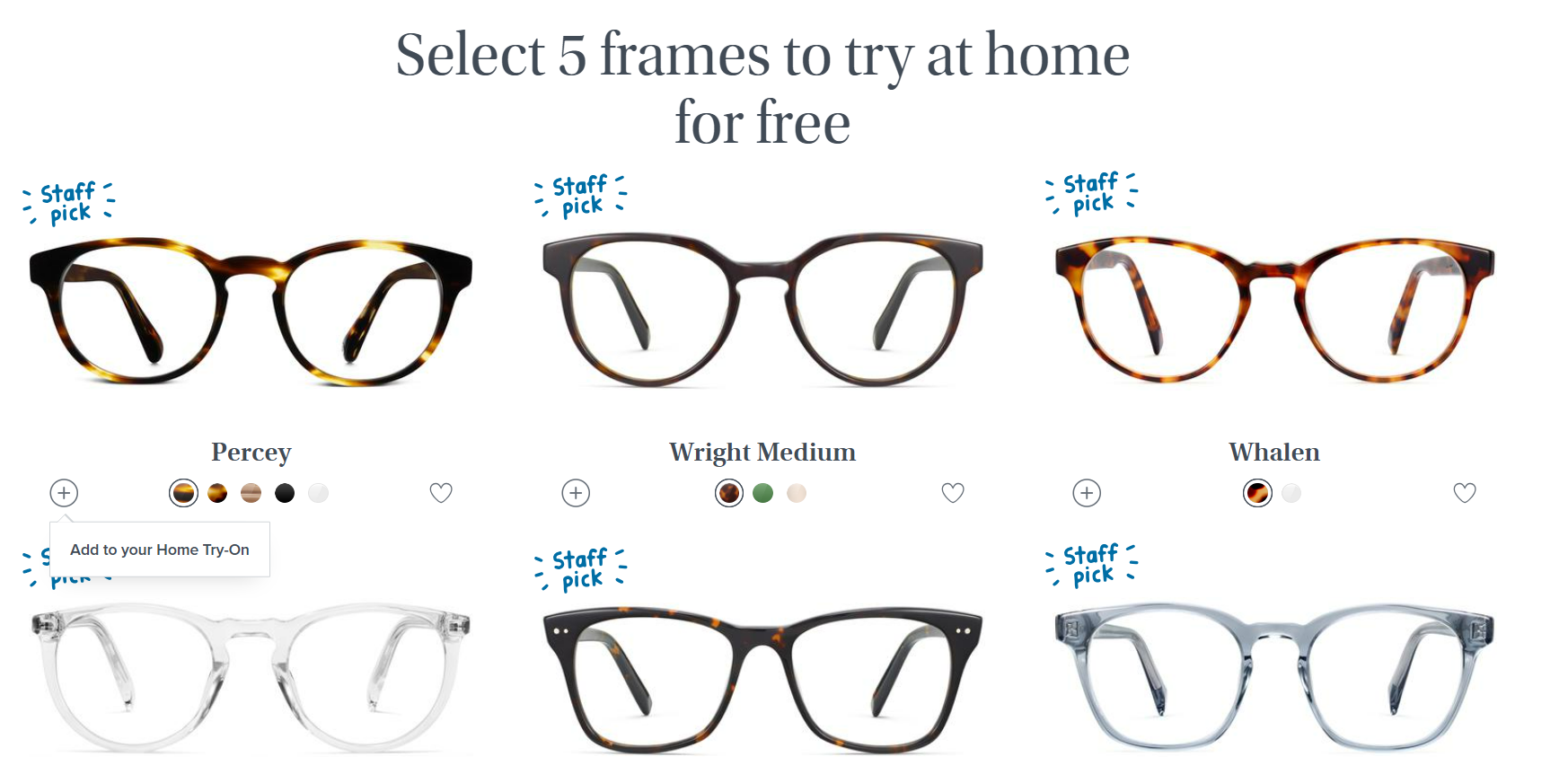
It’s interactive, simple and engaging.
No pressure.
If a user is uncertain about the answer or has no preference, they can skip the question.
The user can also choose multiple answers for some questions like “Which colour glasses do you prefer? A touch of flexibility for more uncertain users.
Anticipate roadblocks like 404 pages
Mistakes are bound to happen when you’re designing a website.
While it may feel like the apocalypse is looming, there’s no need for it to be that dramatic.
In an ideal world, the user experience would be flawless. But this world is far from ideal.
So as the saying goes, be prepared for the worst.
A good place to start is to refine your 404 error pages.
Make the most of your 404 error pages
Your users could run into the brick wall of a 404 error page for many reasons
- The URL is broken
- The page moved and wasn’t redirected
- The server is down
- The user typed in an incorrect URL
- The page never existed
Long story short, the chances of a user landing on an error page are high.
So it’s worth putting some extra thought into the design of these error pages?
Error pages can confuse users or give them the impression that something serious has gone wrong.
Add a little clarity to your error pages and you lower the user’s concern from “broken website” to “minor inconvenience”
A custom error page gives the user a clear path to a new destination on your website, keeping them on your site.
Top brands are perfecting their 404 error pages.
And, of course, we have the receipts to prove it.
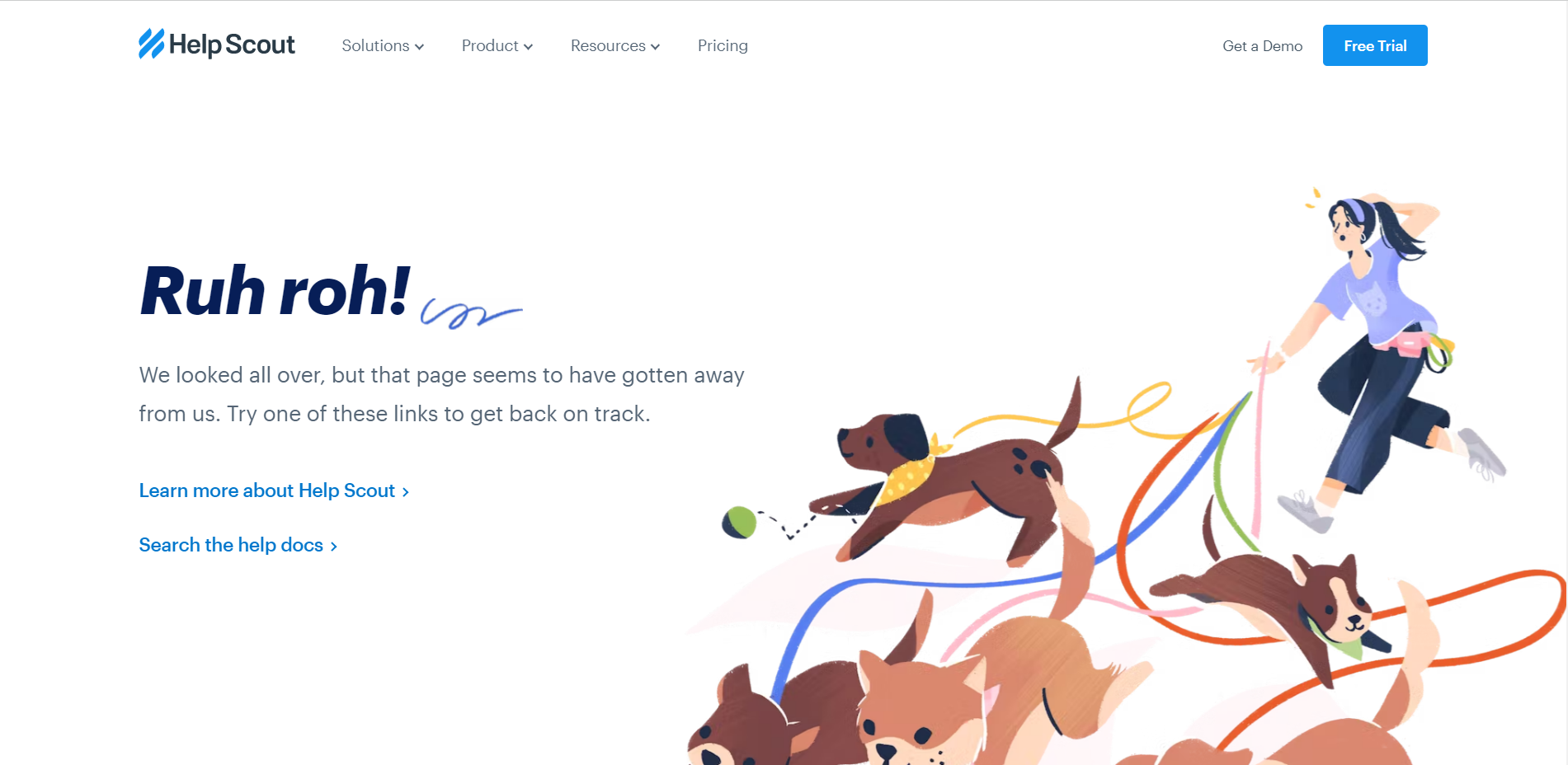
This time, we’re pulling some ideas out of HelpScout’s playbook:
HelpScout's cute 404 page
HelpScout adds links on their 404 page leading to their homepage and customer support documents.
And for the cherry on top, they dropped in some cute dog illustrations to brighten your day.
Voila!
And that’s all he wrote.
Hope you found these ideas useful✌🏿.
Aggée.
